Agency site · design & build
ACU Web
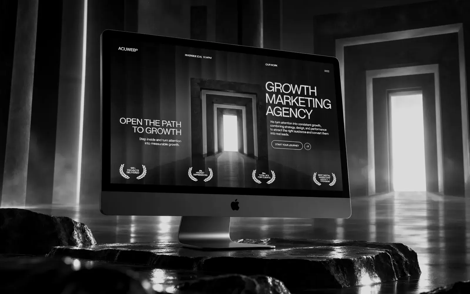
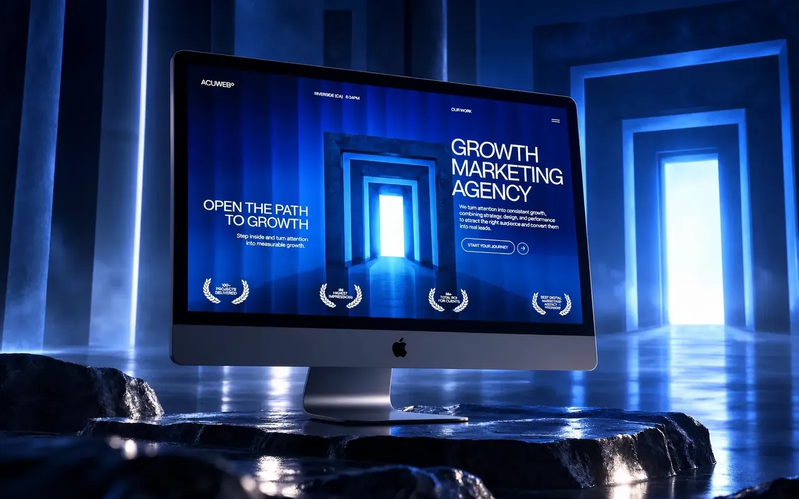
A growth-marketing agency's site, built around one metaphor — a doorway you step through into measurable growth.
- Role
- Design, Development, Motion
Agency site · design & build
A growth-marketing agency's site, built around one metaphor — a doorway you step through into measurable growth.
01 / 13 01 — The challenge
Every growth agency promises the same three things: more leads, better ROI, measurable results. Prospects compare five of these sites in an afternoon and remember none of them. Without a distinct idea, the site becomes another page of claims in a category that has stopped believing claims.
02 / 13 02 — The objective
Give the agency one idea worth remembering, back it with evidence in the first screen, and make the site itself the argument for the standard of work they sell.
03 / 13 03 — The approach
04 / 13 04 — The solution · 01
The doorway idea opens the site and gives the visitor one image to carry away — the thing that gets remembered when five agencies blur together.
05 / 13 04 — The solution · 02
Track-record markers sit in the first screen, so the claims that follow have something to stand on.
06 / 13 04 — The solution · 03
Space, contrast and pacing communicate seniority without a single superlative.
07 / 13 05 — Key decision 01
Sites that hedge across several concepts are forgettable. A single metaphor is what survives the comparison shopping this category runs on.
08 / 13 05 — Key decision 02
It changes the reader's posture: everything after it is read as explanation rather than as a pitch.
09 / 13 05 — Key decision 03
Movement marks transitions and makes the site feel responsive, without competing with the message — and without slowing the page it's meant to sell.
10 / 13 06 — The outcome
The agency has a site built on one memorable idea, with proof placed before persuasion and a level of craft that argues for their standard before a case study is opened. The build is complete and awaiting public launch.
11 / 13 08 — Capabilities
Built with Webflow · Scroll interactions
In one line
An agency that looked like every other growth agency now has one idea people remember — and a site that demonstrates the standard it's selling.
(Next step)
Kendrick Samonte — Founder, BLNKD Studio