Studio site · design & build
Loud Object
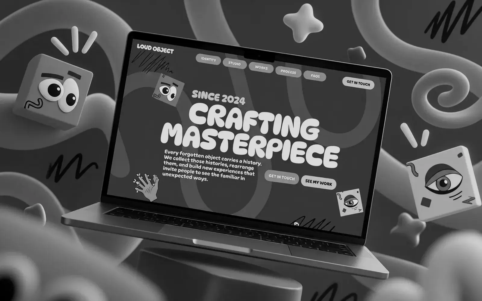
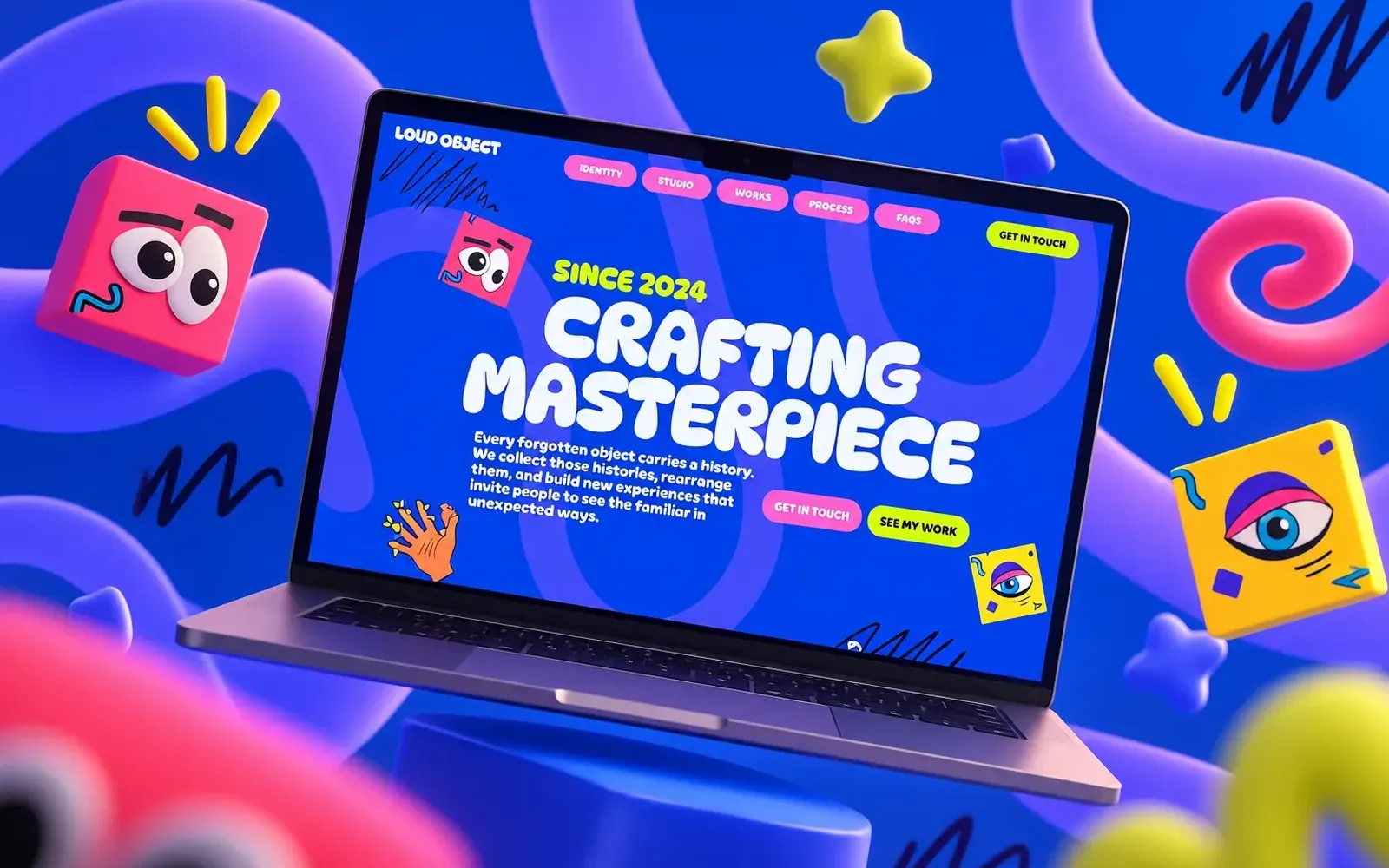
A creative studio's identity site — illustrated, loud and deliberately unlike everything else in its field.
- Role
- Development, Motion, Webflow build
Studio site · design & build
A creative studio's identity site — illustrated, loud and deliberately unlike everything else in its field.
01 / 14 01 — The challenge
A studio whose entire pitch is that it doesn't look like everyone else cannot have a website that looks like everyone else. But the usual result of that brief is a site that's fun to look at and impossible to use — where personality wins and the visitor still doesn't know what the studio does or how to hire them.
02 / 14 02 — The objective
Get the identity fully onto the screen — colour, characters, motion — while keeping the site quick, readable at any width, and clear about what the studio offers.
03 / 14 03 — The approach
04 / 14 04 — The solution · 01
The identity carries the page while type and spacing keep it readable, so the character never costs comprehension.
05 / 14 04 — The solution · 02
Scroll-linked entrances and floating objects mark where the story moves next, giving the page rhythm instead of noise.
06 / 14 04 — The solution · 03
Process, works and FAQs sit close to the surface, so a visitor who's convinced by the character can find the substance immediately.
07 / 14 05 — Key decision 01
Agencies hire a production partner to protect the work, not to simplify it. Keeping the design intact is the service.
08 / 14 05 — Key decision 02
Animation guides attention through the page and makes it feel responsive — the effect is achieved with scroll-linked interactions kept light enough not to slow the site.
09 / 14 05 — Key decision 03
Reflowing rather than scaling keeps the illustrations doing their job on a phone, which is where most of the traffic sees them.
10 / 14 05 — Key decision 04
A creative studio's site is never finished. Handing over the controls is what stops it going stale.
11 / 14 06 — The outcome
The studio has a site that looks like nothing else in its field and still reads clearly on a phone, with motion that moves the story along rather than slowing it down — and the team updates it themselves.
12 / 14 08 — Capabilities
Built with Webflow · Webflow CMS · Scroll interactions
In one line
A studio that sells distinctiveness had to prove it in the first three seconds. It now has a site that does that without making anyone work to understand it.
End of the story
Want one like it? Tell us what it has to do.
(Next step)
Kendrick Samonte — Founder, BLNKD Studio