Campaign page · design & build
RealVoice × ACU Web
A joint landing page for two partner studios, built to introduce a combined offer and capture enquiries from one page.
- Role
- Design, Development
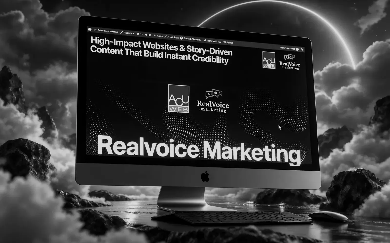
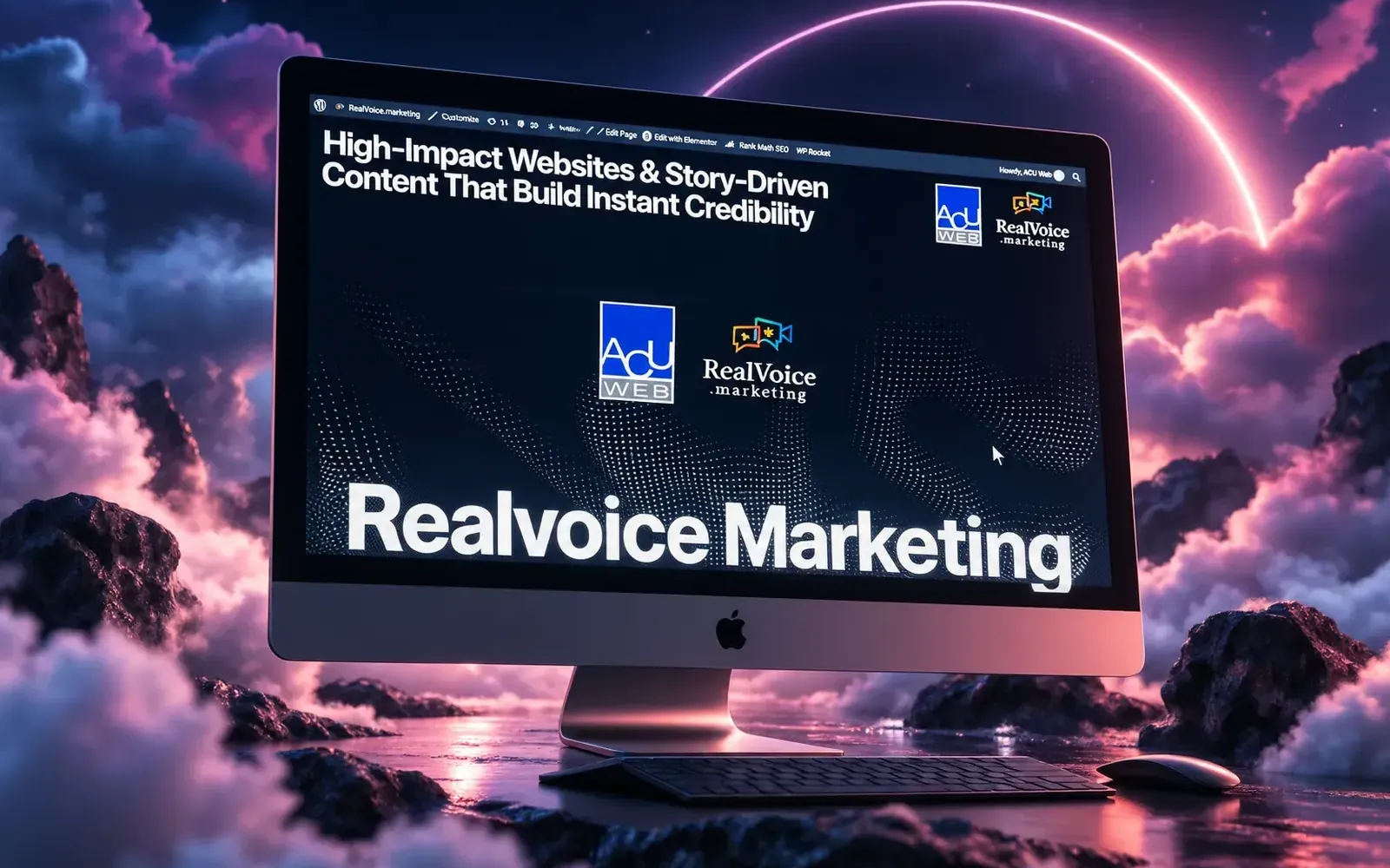
Campaign page · design & build
A joint landing page for two partner studios, built to introduce a combined offer and capture enquiries from one page.
01 / 13 01 — The challenge
Two companies, two brands, one combined service. Partnership pages usually end up explaining the partnership — who does what, how the companies met — while the prospect is still waiting to hear what they actually get. The page also had to be sendable as a single link in outreach, without leaking visitors into either parent site.
02 / 13 02 — The objective
Make the combined offer land in one screen, make both companies feel like one team, and get an enquiry from a page that many people will only read a third of.
03 / 13 03 — The approach
04 / 13 04 — The solution · 01
The first screen names what the two studios do together and for whom, so a prospect knows within seconds whether to keep reading.
05 / 13 04 — The solution · 02
Shared layout, type and tone carry both brands without the page becoming a corporate announcement.
06 / 13 04 — The solution · 03
The same enquiry step reappears through the page, so a fast reader and a thorough one both arrive at the form.
07 / 13 05 — Key decision 01
Campaign traffic arrives with intent and little patience. A single path protects that intent.
08 / 13 05 — Key decision 02
The page lives inside the existing site as a standalone template, so the next campaign is a duplication rather than a new build.
09 / 13 05 — Key decision 03
It sits inside an existing site without breaking its rules — the production partner's job is to fit in, not to redecorate.
10 / 13 06 — The outcome
Both studios have a single link they can send in outreach that explains the combined offer in one screen, keeps both brands intact, and collects enquiries — with a template ready for the next campaign.
11 / 13 08 — Capabilities
Built with WordPress · Landing page template
In one line
A partnership that needed explaining now sells itself in one screen — and the next campaign starts from a template instead of a blank page.
End of the story
Want one like it? Tell us what it has to do.
(Next step)
Kendrick Samonte — Founder, BLNKD Studio